Salesforce Lightning has truly brought a lot of power into the hands of both Admins & Users. Meaning that the layout and experience can be customized to suit groups of users or individual’s needs. Admins can now change up the layout using standard Lightning components to create a unique experience for their Org, but users also have a bunch of features they can use to customize their individual layout.
Let’s dive into 5 features that any Salesforce Lightning user can start using right away to make themselves more productive.
Lightning UI Changes for Users:
All of these features can be easily accessed from any Lightning Org in a matter of seconds, you can play around with any combination of these features to create a unique experience for yourself.
- Favorites:
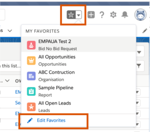
You may have noticed the Star icon at the top right of your screen before. Similar to browser functionality, this allows you to Favorite pages you want to access quickly. This does not just apply to records, but you can favorite List Views, Reports, Dashboards etc…
To work with Favorites you simply need to hit the star icon when you are on the page you want to favorite. To delete, rename, or reorder your favorites, simply click on the “Edit Favorites” button at the bottom. Enjoy!
- Pinning List Views
Have you ever been frustrated with the way that Salesforce always defaults to the “Recently Viewed” List View? Well now there is a solution! Every object home page in Salesforce now has the addition of a little pin icon next to the list view. By clicking this, you will skip to this List View every time you click on the object home page.
“Sure this one will save you a lot of clicks every day.”
- Customizing the Navigation Bar
With the introduction of Lightning, has brought a fully customizable Navigation Bar. As a user, you have full control of..
- The order in which the tabs appear
- Adding extra tabs
- Adding Records, List Views, Dashboards, Reports and more to the Navigation Bar
- Renaming some of the navigational items
This means that you have the ability to completely change the standard view you see everyday.
- Density Settings
Added at the end of last year, Salesforce has given all users the ability to change how much data they view on their screen. When Lightning was brought out, the layout looked a lot cleaner than Classic, but at the cost that less information was shown at one time.
If you have a particularly information-heavy Org where you would like to see as much as possible, then this setting is for you. There are two options, Comfy, or Compact. Compact will give you more of a Classic feel with a lot more information being visible on your screen at one time. Check it out for yourself!
- Kanban View
One of the first images I remember seeing of Salesforce Lightning was the Kanban view on the Opportunities object. This was a serious game changer for Sales users, allowing them to see their Opps in a much more logical view than simply a list of data. This is also relevant for any other process-driven records such as Leads or Cases. As well as a different layout the Kanban view also…
- Let’s you see the total amount in each stage
- Allows you to drag and drop Opps to different stages
- Has a notification that gives you relevant information (Such as when an Opp has no next steps in the form of a task)
Here is a great overview of how this works, and if you want to turn on Kanban right away, simply navigate to the icon right to the gear cog.
Via: C2N IT CoE


